My most recent art project was a quick mixed media piece, titled Blue (at least for now)
|
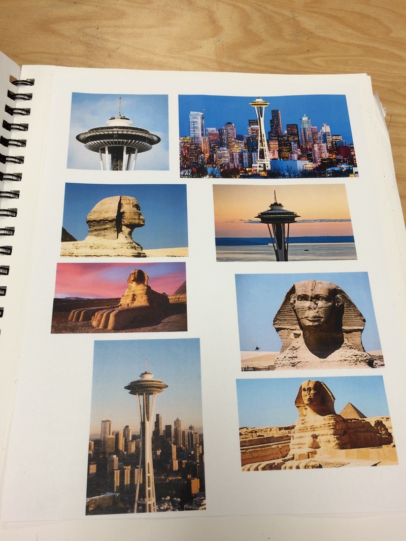
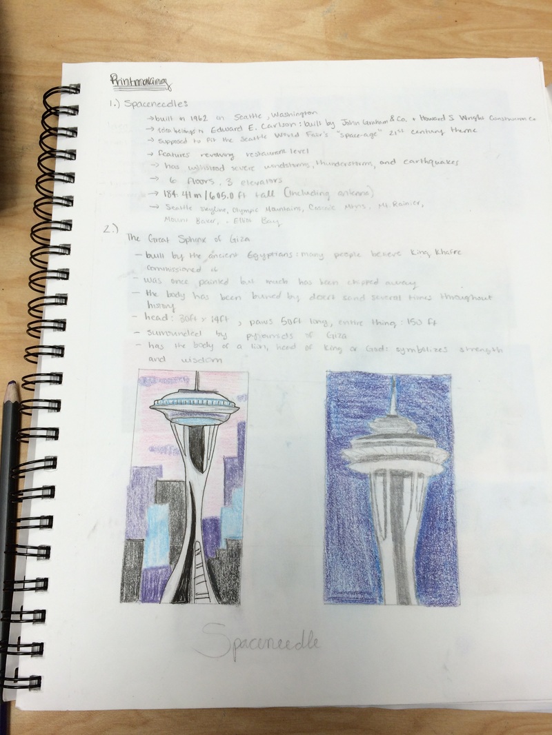
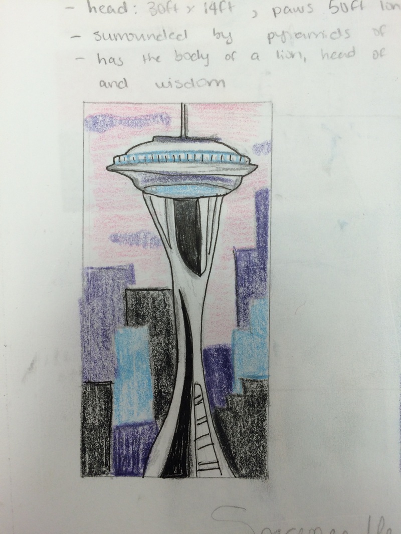
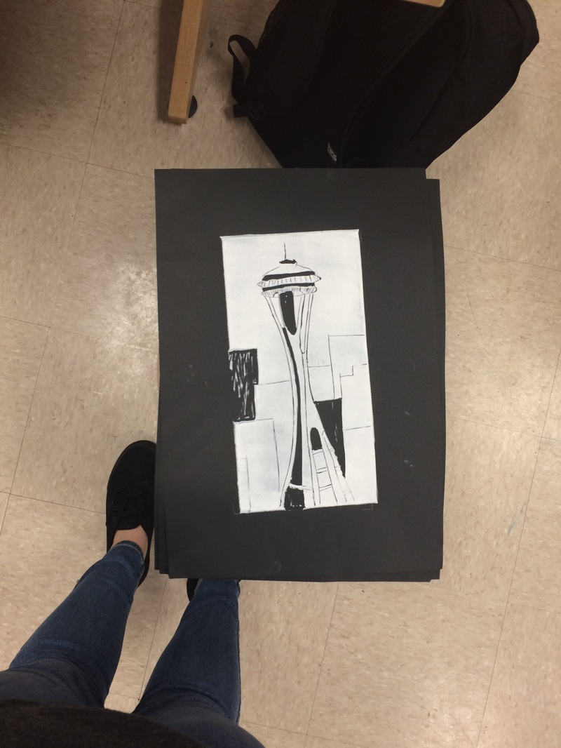
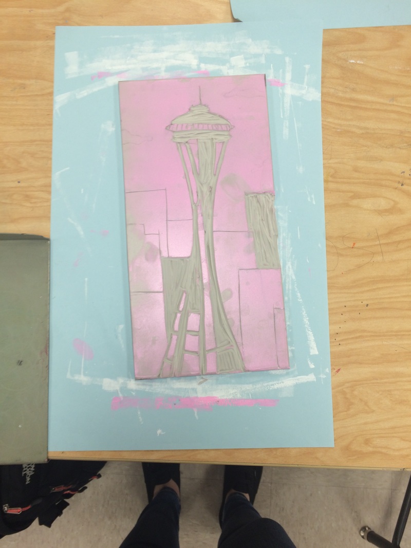
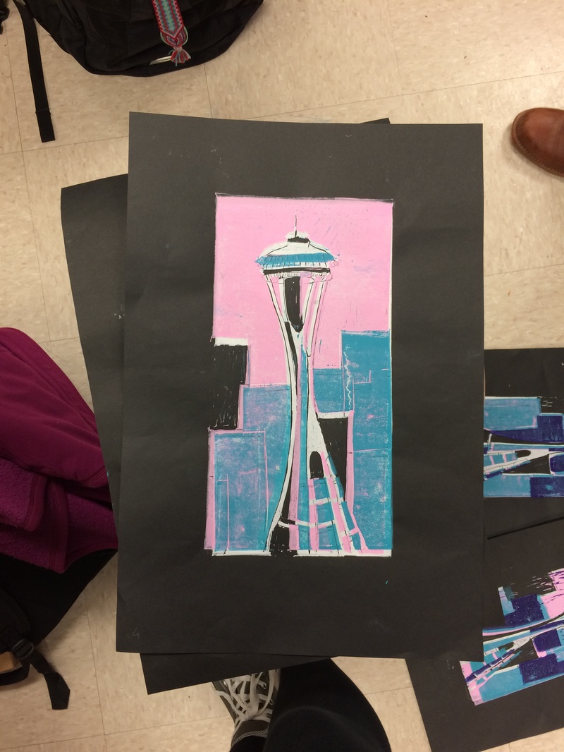
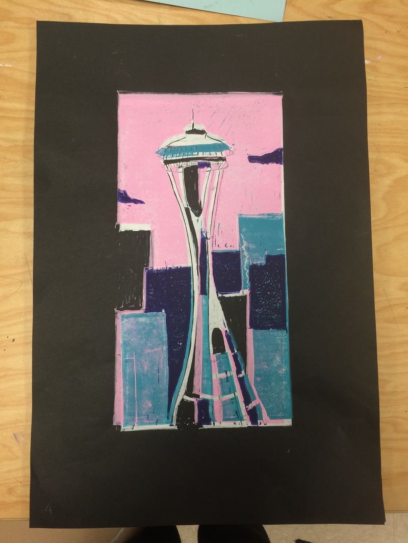
Technical Qualities This project was one of my favorites, because all though it was time-consuming, the end result was really worth it. To create this piece, I used a 6 x 12 inch piece of linoleum, carving tools, and printing ink. I used a piece of black paper, so first I carved out the parts I wanted to be black and then used the white ink to print the design onto the paper. I repeated this step of carving, inking, and printing with all four colors of ink until I had the image I wanted. This project took a little over two weeks in total to complete the research, sketches, carving, and printing. At some times, I faced challenges when the ink appeared in places I didn't plan for it to be or I wouldn't align the linoleum perfectly. I found this really frustrating at first and honestly hated my prints because I thought they were ruined, but I slowly came to the conclusion that the slight misalignments and small lines of ink added to the piece, rather than taking away. I tried printmaking on a much smaller block in Art 1 and mine turned out TERRIBLE, due to lack of patience, attention to detail, and lack of artistic skill. This time, I actually love my final prints (or at least the one that came out okay) and I'm really proud of how much work I put into them and how well they turned out. Depiction My prints are of the Spaceneedle, an iconic tower located in Seattle, Washington. I adore Seattle, it's my favorite place I've ever been to and where I'd like to live one day, so I really wanted to incorporate the beautiful city into my artwork. Ms. Rossi told us we could choose a historical subject or an architectural subject, and I knew this was the perfect time to create something centered around Seattle. I looked at many reference photos for the Spaceneedle itself, but I used a bit of imagination for the background. On special occasions they can light the top part of the city up in different colors, but it's normally black and white. I decided to do blocks of color in the background to resemble buildings and I created a pink sky with purple clouds to add more color into it. I also put small touches of color in the tower itself. I love the way the color scheme turned out, I think blue, purple, and pink really complement the contrast of the black and white tower. I think the structured shapes and sharp lines of the prints really emphasize the sleekness and modernity of the Spaceneedle and of the city itself. Design When looking at my print, I think it's very interesting and aesthetically pleasing. The focal point of it is obviously the tower itself. At first glance, someone would immediately look at the tower because of the contrast of it against the background. I think the lines and shapes within the tower as well as the spots of color are really eye catching and capture the viewer's attention. The soft clouds and lighter, softer colors in the background create a really cool contrast and I think overall it is very interesting to look at. Expressive Qualities When I look at my piece, I feel a sense of calmness. I think the pink sky and purple clouds make it seem like it's sunrise or sunset, which are times I automatically associate with peacefulness. I feel proud of my work when I see it, and I also feel really happy because I do love Seattle so much. I think most people would immediately recognize the Spaceneedle as a major landmark of Seattle. I think its beauty and calmness will really catch people's eye and make them feel a sense of happiness or serenity. Perhaps other people have particular feelings associated with Seattle, so I think the feeling people get from the prints really depends on their relationship with and feelings toward the subject. I am really pleased with the way my project came out and it really made me enjoy printmaking, I would love to do another project like this one. The frustration and time were so worth the final project. I enjoy looking at my piece and I hope others will experience the same kind of happiness that I do when they see it. Photo Descriptions:
I have included photos of my initial sketches, reference photos, in-progress shots, and the final picture is my final project. Our most recent project used clay and either acrylic paint or clay glaze to sculpt a piece that looked exactly like a specific type of food. I chose to mold the clay into a bowl of Fruit Loops cereal, using clay, acrylic paint, and polyacrylic coating. I developed my art making skills in this project by working with clay, something I have only worked with her once or twice before. I was nervous about this project because I did not know much about how to work with the clay. Mrs. Rossi taught us many different techniques to make our projects. I used the slip and score method and the coiling method in my project. The slip & score is a way to attach pieces of clay together and the coiling is how I made the bowl. I solved problems in this project because I overcame many obstacles while working with the clay. The clay became very dry and cracked throughout working with it, which posed a problem. I used the water to try and get rid of as many of the cracks as I could, but in the end, I think the cracks give some texture to the fruit loops because the cereal itself is very cracked and crumbly. I think I learned from my mistakes in this project, so next time I work with clay I know I'll want to take my time with it and make sure there aren't any cracks or imperfections in the piece before firing it in the kiln. Now that I've finished the project and am able to reflect on it, there is a lot I would have done differently. I do like the way the acrylic looks; I think the colors are pretty accurate to fruit loops. maybe next time I'd add more white to the paint for a more pastel color. If I was to redo this project, I think I would choose a different food, because I found the Fruit Loops to be a difficult and tedious project. It took a long time to make each of the individual pieces and I don't think the end result looks very realistic. Fruit Loops have a strange texture that is hard to re-create with clay. I also dislike the way my bowl looks, so next time I think I would glaze it because I like the appearance of that more. 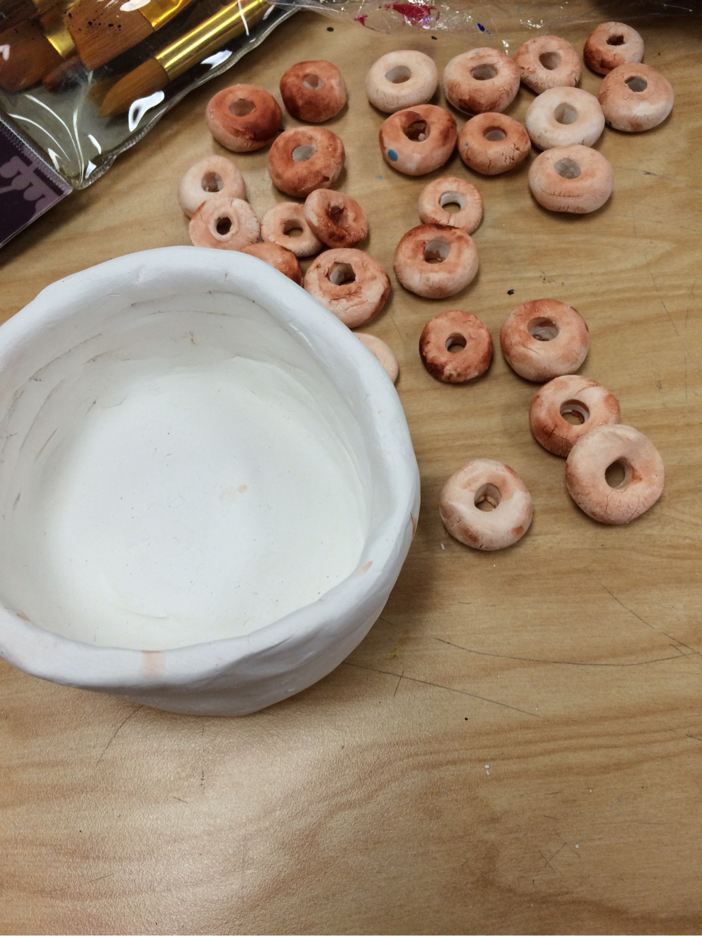 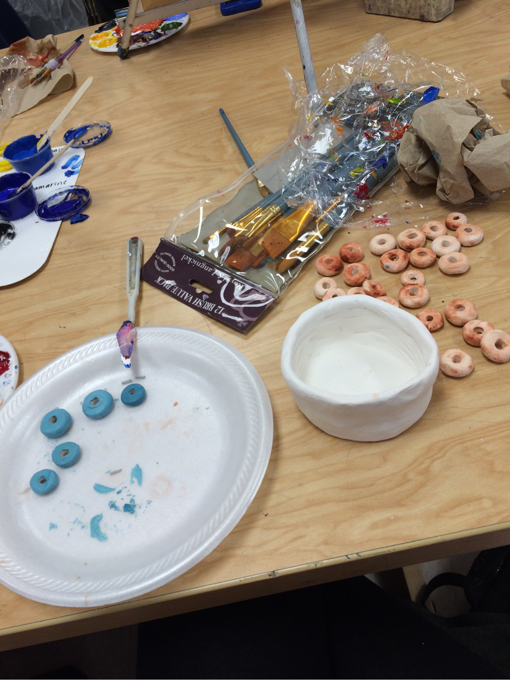 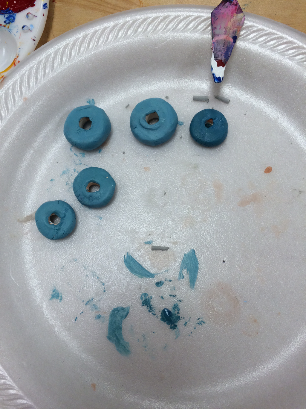 (in-progress photos of clay project) 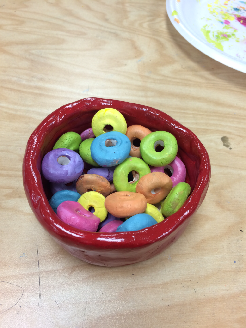 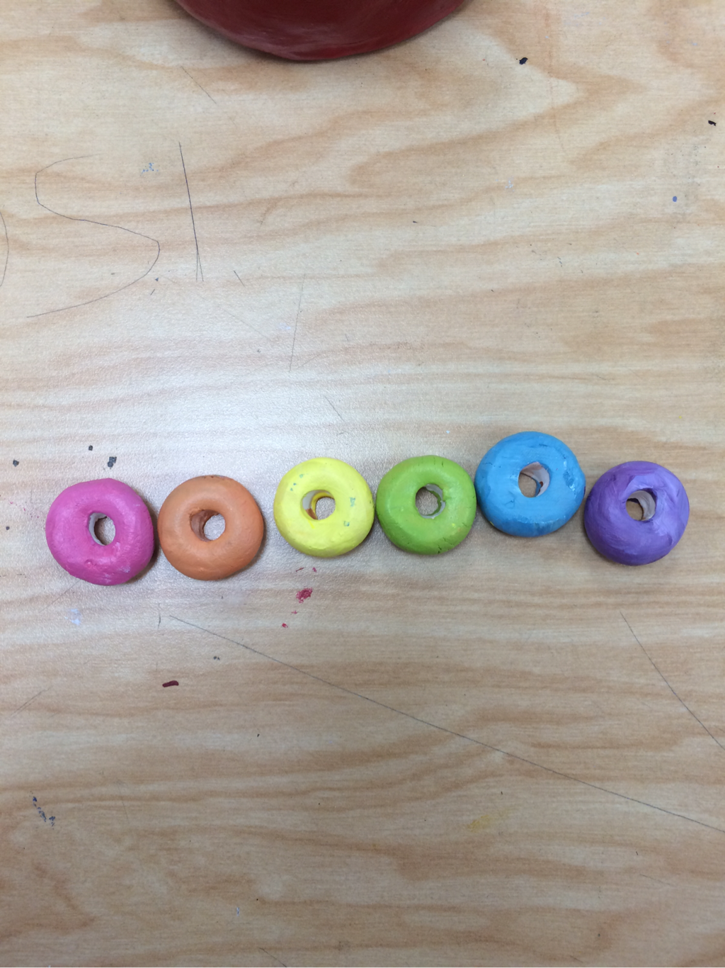 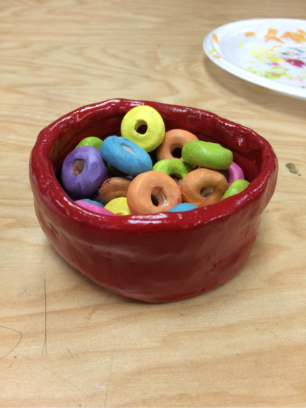 final project
For this project, we were assigned a famous artist to research and create a painting imitating their artistic style. I was given the artist Paul Klee and did extensive research on his works and his style and process of painting. Klee was a very influential part of the German Expressionism movement of the early 20th Century, best known for his unique use of colors and shapes in his paintings. I feel that I showed a global awareness of art making with this project by taking so much inspiration from an artist as famous as Paul Klee. I especially liked his use of squares of color and different shapes in his paintings, so I tried very hard to incorporate those into my painting. I used the Internet and a book on Klee to learn as much as possible about his style and process of working. I developed my art making skills with this project my learning many new painting techniques from Ms. Rossi. I have worked with paint before but only a few times and never very extensively. Ms. Rossi showed us new ways of painting, like using a wash on the canvas and mixing colors to paint with. I used a tonal burnt sienna wash on my canvas, which is basically just a sheer layer of brown paint underneath the paint with different values based on the darks and lights of the painting. Now that I have finished my painting, I am able to reflect on my work. Overall, I am very pleased with the way my painting turned out. However, there are areas of the cat where the paint colors look uneven and parts where the oranges and reds bleed into the background, which I am not too happy about. I also wish I had gone over some of the black lines with a second coat of paint to make them more dark and opaque. I am very pleased with the overall look of the painting. I like that I chose orange and blue because they are complementary colors and really make the painting look nice and vibrant. 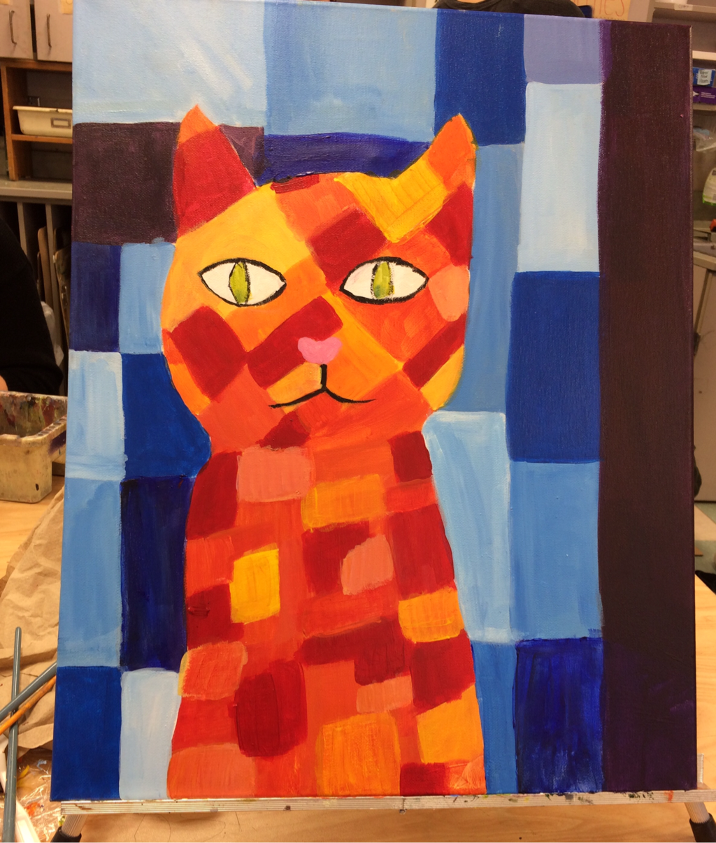 in-progress (almost done!) 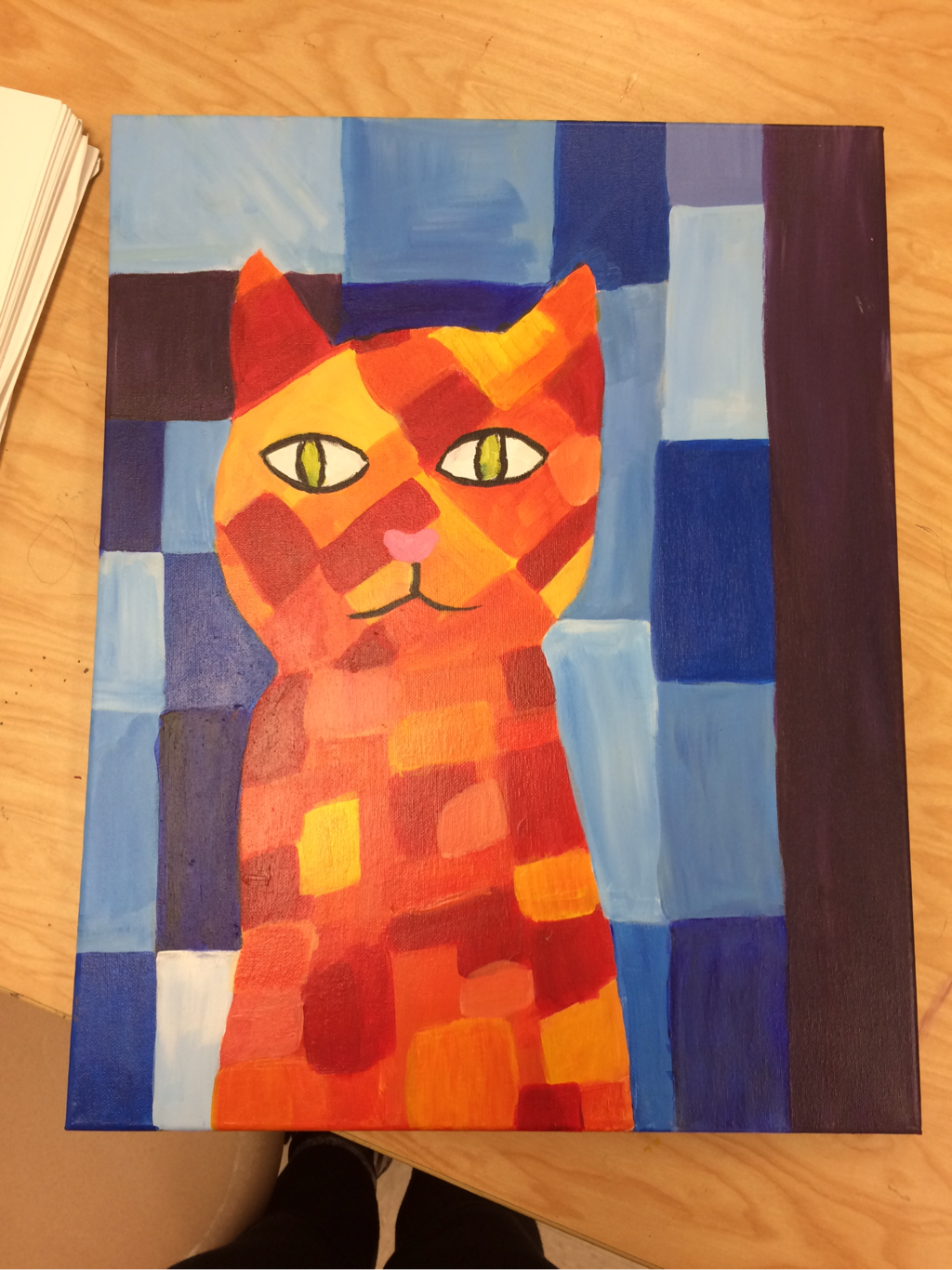 final piece 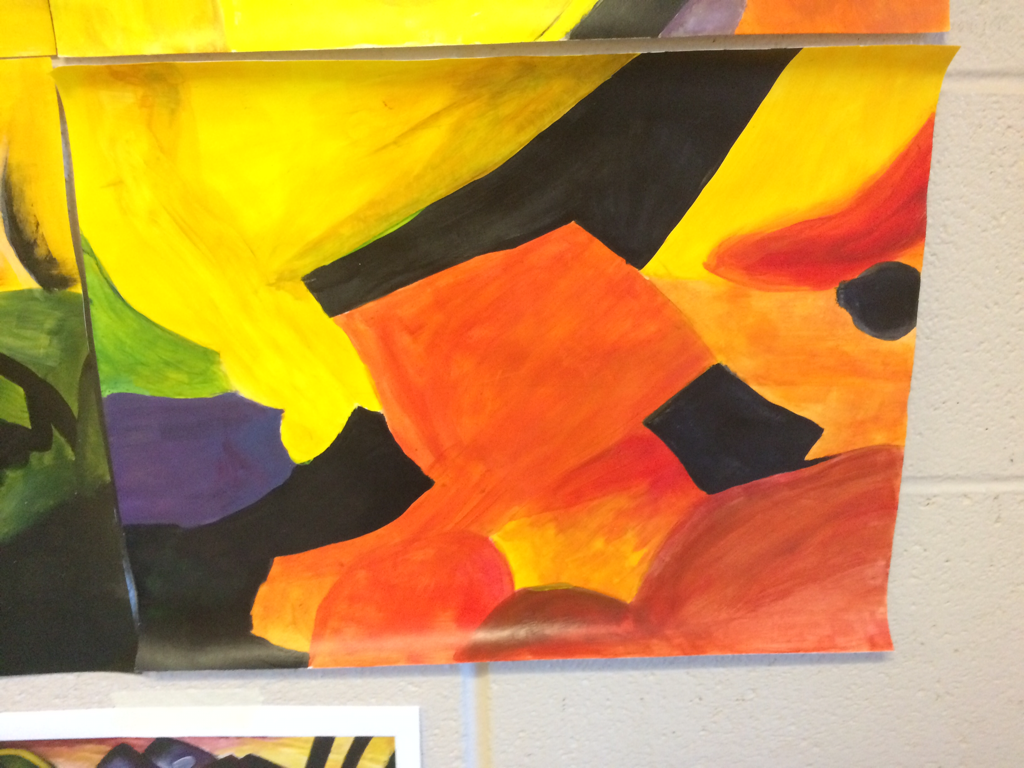 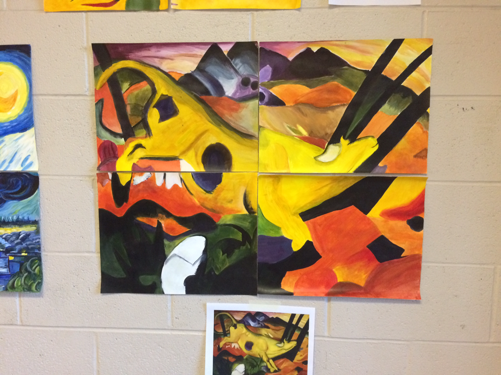 a painting I did as a practice for this project, a fourth of a famous painting! 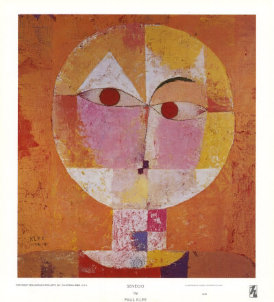 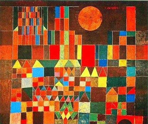 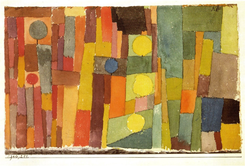 Some of Klee's most famous works of art that I took inspiration from
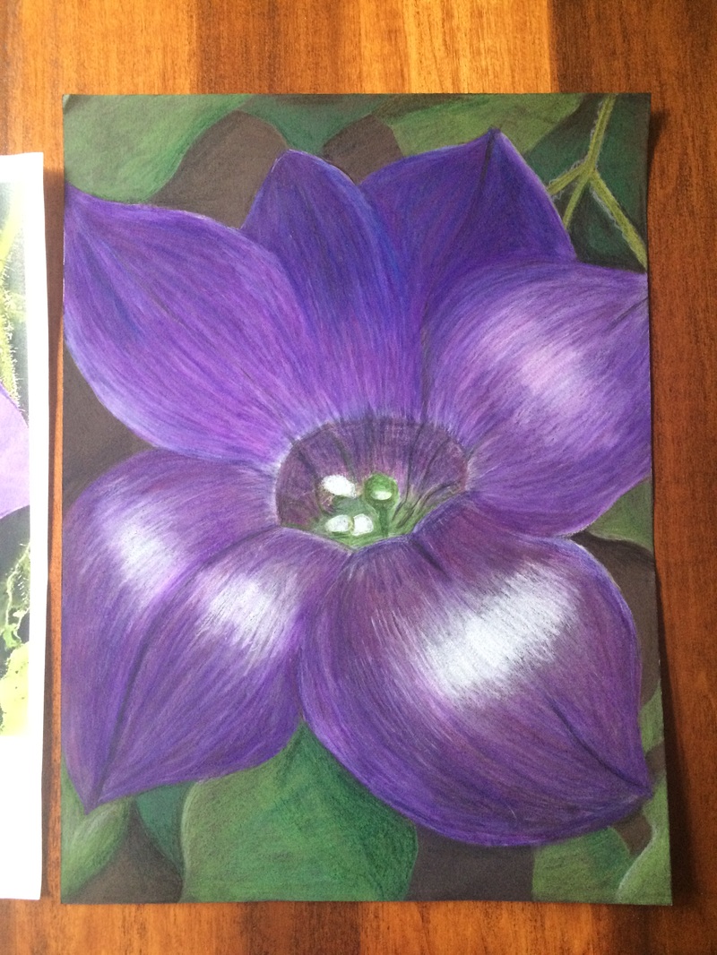
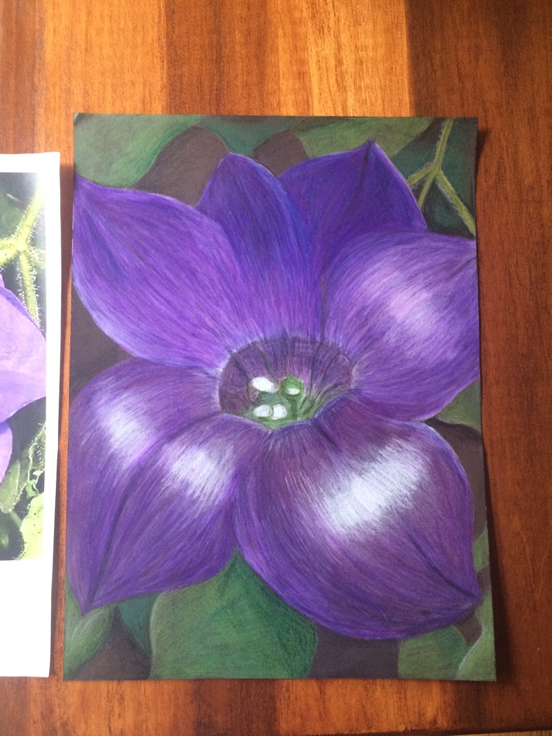
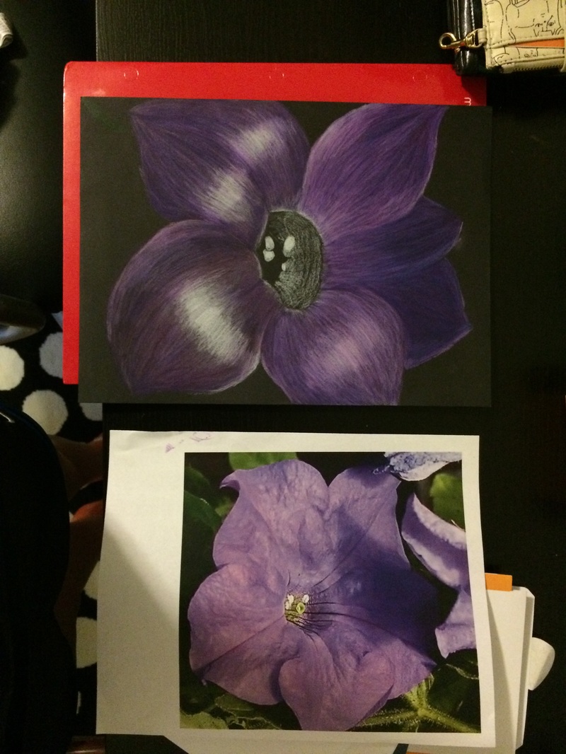
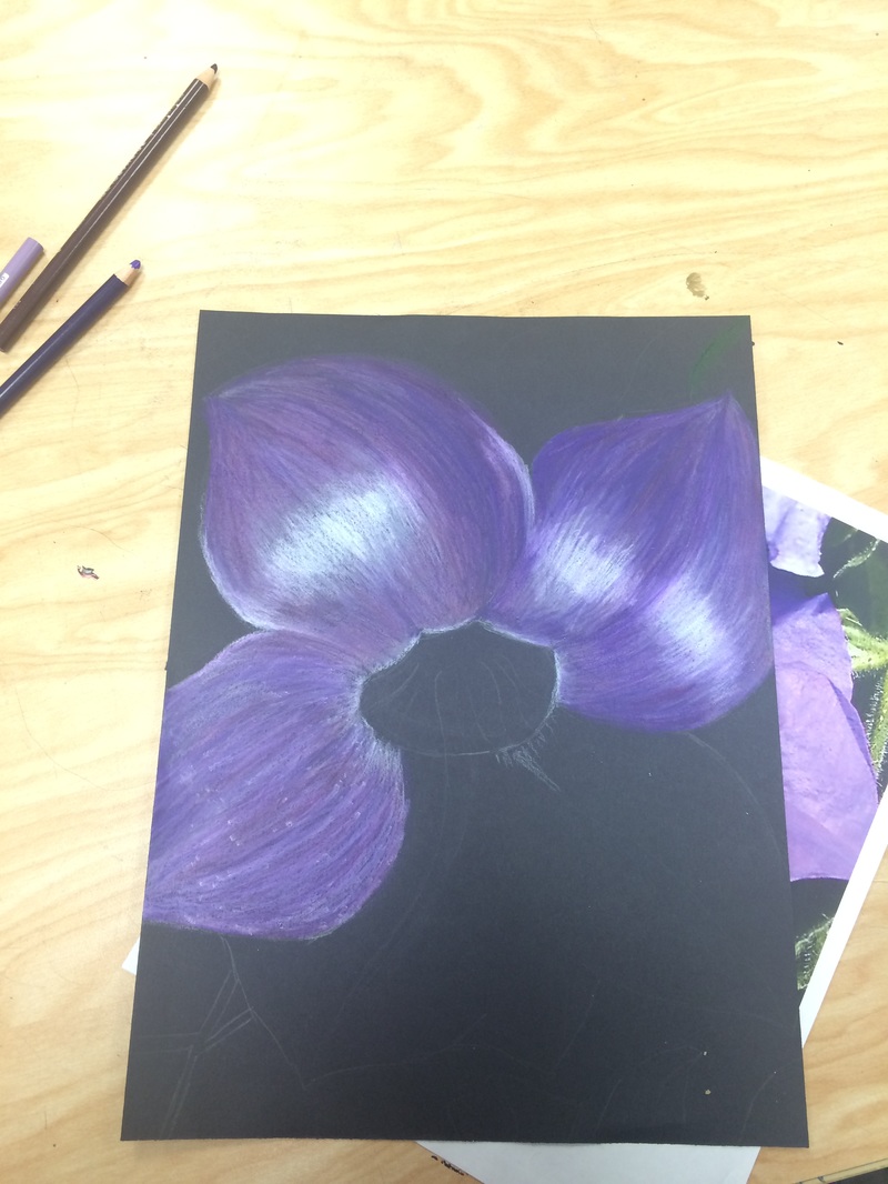
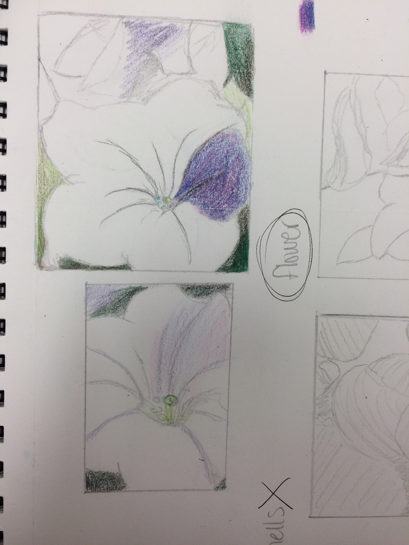
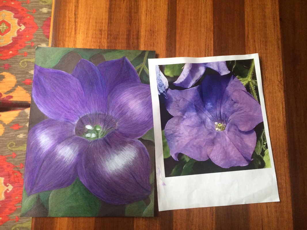
The iconic 20th century artist Georgia O'Keeffe was famous for her detailed nature works. Many of her well-known paintings were large scale zoomed-in pieces of flowers and plants. For our last project, we were to draw inspiration from her up-close style of painting, using either oil pastel, chalk, watercolor, or colored pencil. I chose colored pencil for my piece, and I used a photo of a flower on my porch for reference. I was drawn to the beautiful color of the flower and its interesting shape. With this project, I developed my art-making skills. I had used colored pencils in works before, but I had never attempted such a detailed and vibrant subject matter. This was my first time working with Prismacolor pencils too, which are softer and easier to blend than other colors. I really enjoyed working with Prismacolors, but it was definitely a challenge to get used to them. I learned how to add brighter highlights and darker shadows using the Prismacolors. Overall, I think I did well with these materials and I learned a lot about them through this project. I believe I demonstrated a global awareness of artmaking with this project as well. I researched Georgia O'Keeffe and learned as much as I could about her style of art and the way she worked. I tried to use her technique of zooming in on the photo in my final art. I used the Internet, mostly sites like Pinterest, to save interesting photos of her work. I think art is an amazing tool of communication and with today's technology it is easier than ever to appreciate and learn from the art of others. Reflecting back on this project, I think I did a very good job. I gained tips and insights from others during the process, as well as stopping to analyze my work many times. I took a few in-progress photos of my drawing, which I've included in my blog. I think stepping back and analyzing your work is really important as an artist. I tested out many different techniques and ideas in my sketchbook before I started my drawing, and I think it really paid off. I am very satisfied with this project and I will hopefully be working with these materials again in the future. I have included many photos, including my references, sketches, in-progress photos, and my final drawing! To help prepare for the project, we worked with many different mediums in class. We worked with drawing cans and apples from life, using oil pastels, colored pencils, chalk pastels, and watercolor. 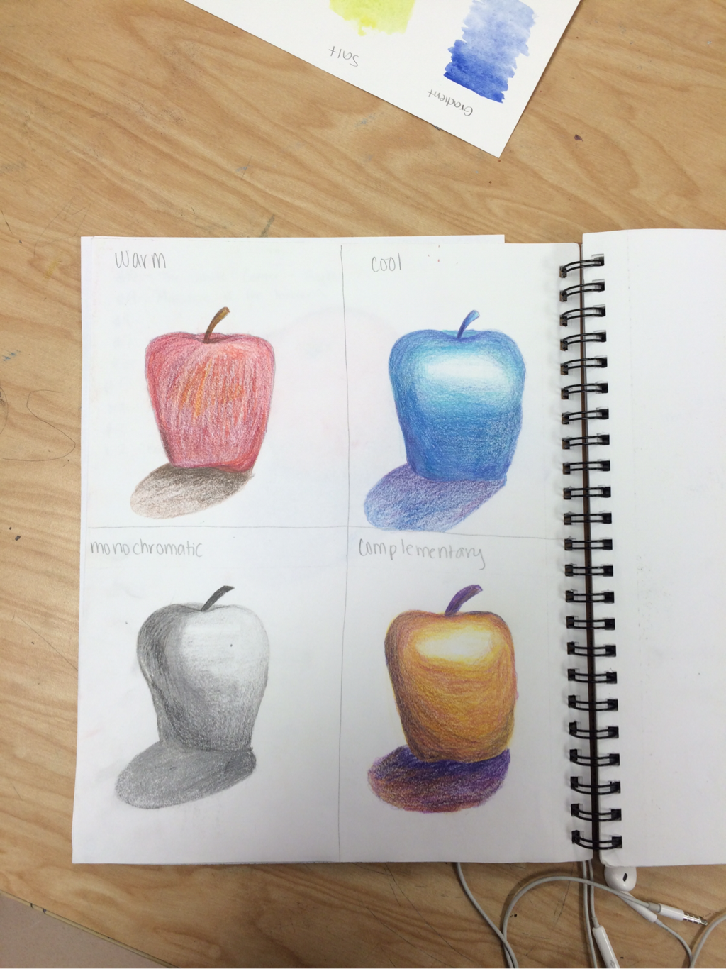 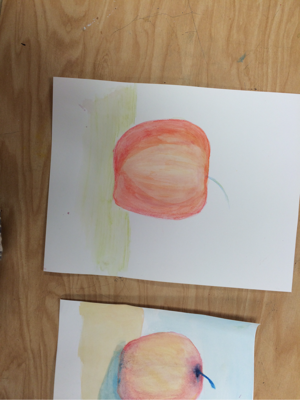 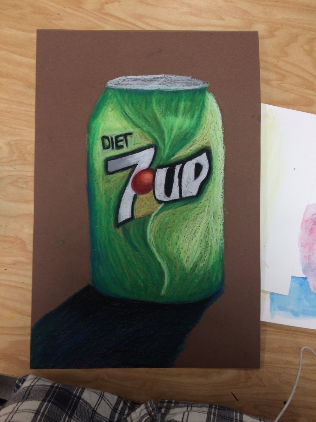 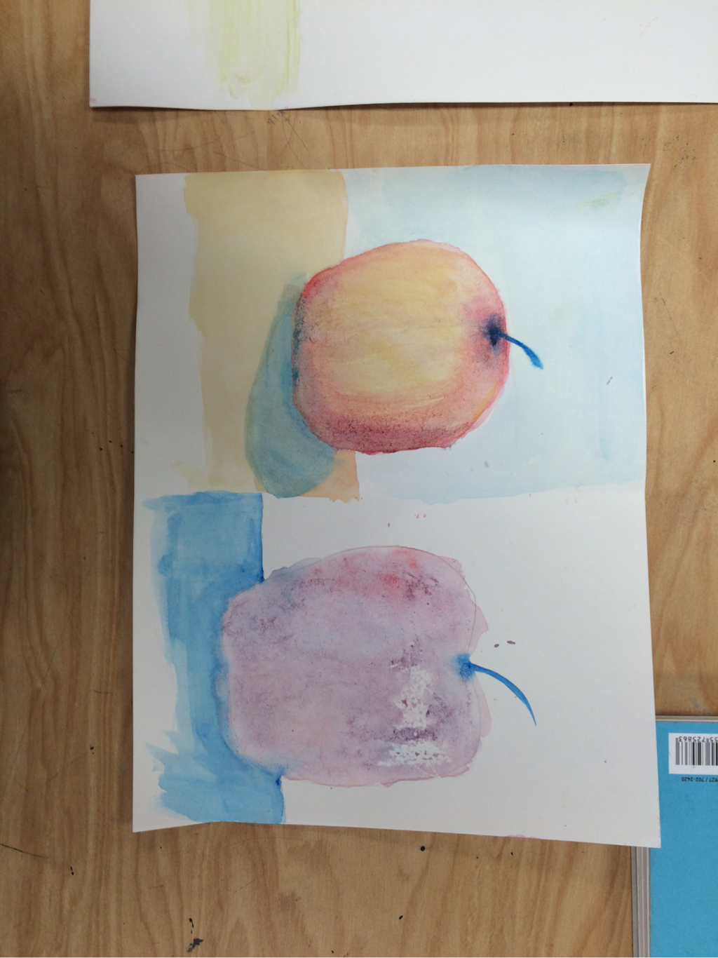 To prepare for my perspective project I drew multiple shapes, giving them dimension with the use of value. I also made several value charts with different materials to gain skill with pencil and pen. 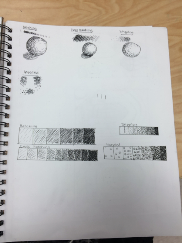 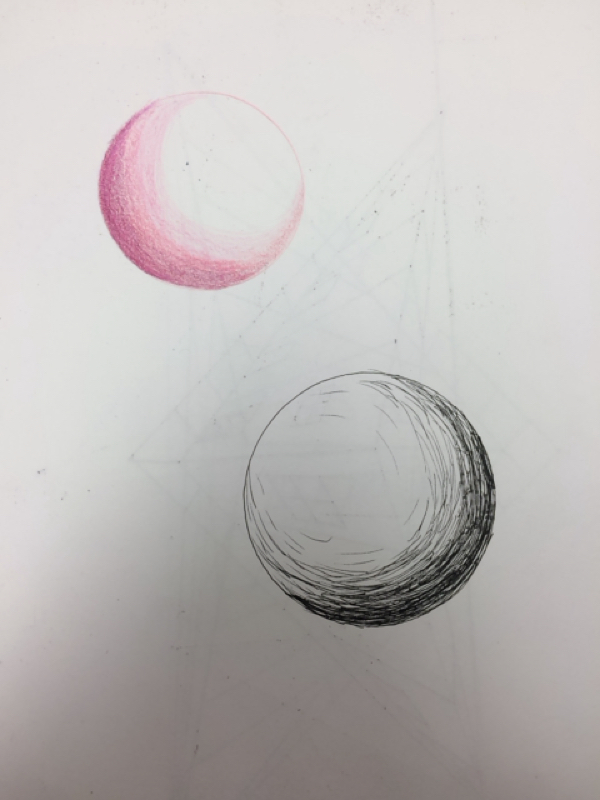 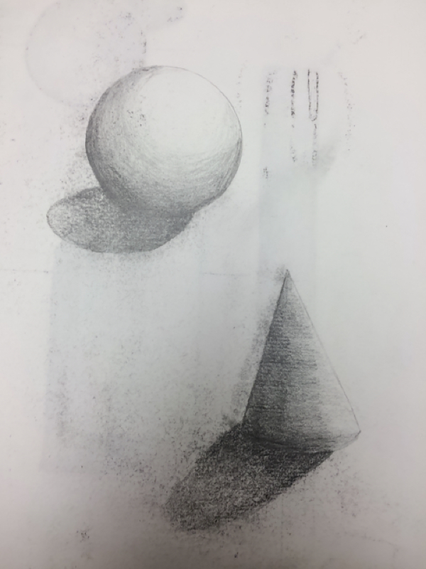 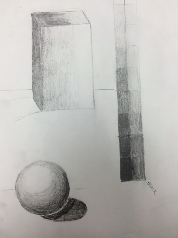 For my Perspective Project, I drew the library at the University of Washington in Seattle, WA using various graphite pencils. I have included my reference photo, my final project, and an in-progress photo. I also included photos of the shapes and value charts I drew to practice different shading techniques using pen and pencil. 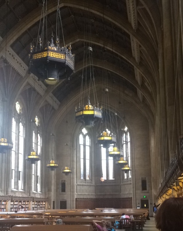 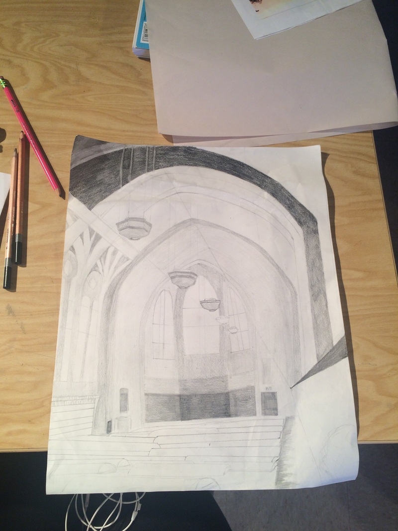 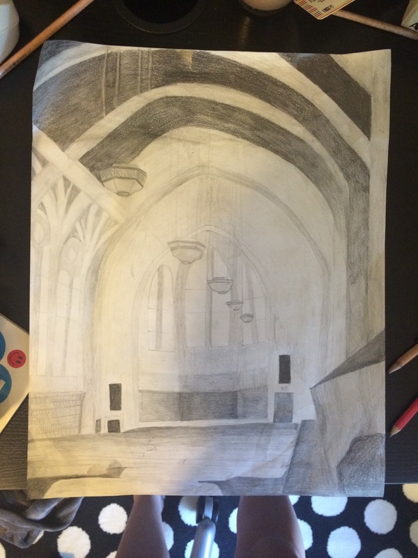 |
AuthorWrite something about yourself. No need to be fancy, just an overview. Archives
January 2016
Categories |
 RSS Feed
